
Experts Talk: Value of Realistic Signature Bridge Visualization with Jimmy Vincent
Experts Talk is an interview series with technical leaders from across our transportation program.
Building Community Trust in Bridge Design Through Contextual, Authentic Renderings

Signature bridges require a special level of imagination, creativity and panache. Aesthetics are integral to the design, paying special attention to visualizing how the concept fits into and impacts the site and community.
In this interview, Jimmy Vincent, a transportation project designer with more than 14 years in the industry, shares how he uses his unique artistic approach and experience to depict projects as they truly will look and feel on a daily basis to the stakeholders, once built in their environment.
Jimmy’s project visualizations are scrupulously authentic in their depictions of not only the projects, but also their environment. He pays especially close attention to how users will experience the structures. His emotive renderings help clients, project teams and communities imagine their future and understand how new infrastructure will change the experience for people who interact with it.
Realistic Signature Bridge Visualization
Q. When do more emotive renderings/visualizations help an owner collaborate with a community in developing a signature bridge?
A. The typical rendering tries to capture everything about the project in one image, often in an ideal context. The scene is a sunny day, a child holds a balloon, the surrounding landscape is perfectly groomed. The image is rather easy to understand and shows the project at its best. But it’s not as realistic as what you might photograph on your cellphone later after the project is built.
Community-driven bridge design pays attention to how bridges look in the environment and how people will think about and feel about the resulting structure. Developing an emotive rendering is a tool to help achieve that community-driven design approach. Realistically visualizing a proposed project can vividly manifest the resulting design, which promotes honesty in decision-making as the form of the bridge is discovered. We want honesty with the client; this is really what it’s going to look like in context and lighting. We want to establish honesty with the public; this is what it’s going to look and feel like, and what your experience will be like in your backyard.
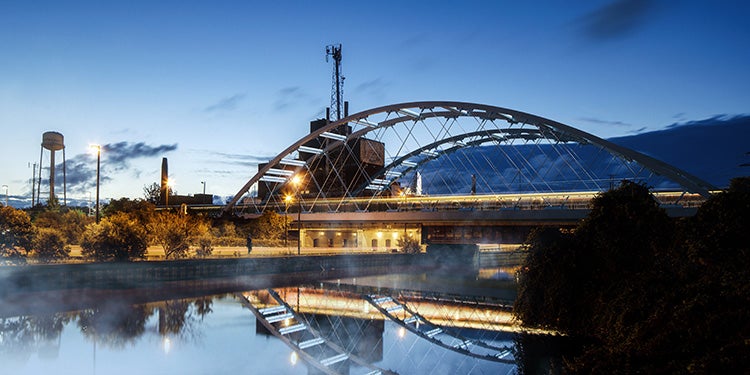
An example of where this mattered is our design for the Lower Don Bridge on the Ontario Line in Toronto, Canada. The surrounding neighborhood is lit with high pressure sodium vapor light fixtures, which have a particular look and feel. By insisting on depicting our design in context of the typical neighborhood lighting, we fostered discussion in the project team that improved the design and bridge lighting and gave the public a truer preview of what to expect once the bridge is built.
Q. How does your rendering work complement HDR's signature bridge design practice?
A. This work is integral to our community-driven bridge design approach which begins with form finding and concept development that reflects the community’s values and thinks about aesthetics and the user experience from the very beginning of design development. As we explore the wide range of options a community may consider, depicting those concepts as they realistically might look and feel in the community is vital to building the trust and credibility that is so vital to a signature structure program.
Signature bridge design can involve a lengthy process with many stakeholders that’s not always straightforward. Communities or clients may go to a well-known industry architect who creates a unique form. But is the community really ready for such a unique design? Is that design buildable? Does it fit with the community’s culture and history?
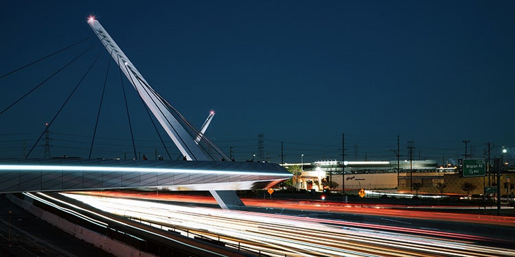
Of course we have the bridge design technical prowess to deliver a major signature structure, but mixing in the high-end conceptual design perspective adds a very powerful combination to engage the community in defining the form that makes an iconic, signature bridge. For example, for many of our projects in the Los Angeles area we consider and depict how the traffic will appear on and around the structure because the public will typically experience the structure from their perspective that depends on whether traffic is moving or slow. Our depictions help the community engage with the project and help our project team develop options that are true to the community’s expectations.
Q. Can you describe how your approach to project design visualization results in a better end-product?
A. I bear in mind lessons from cinematography — staged reality evokes thoughts and feelings. It compels the viewer to step into the image. I think of project images as a tableau, which is defined as a painting or photograph in which characters are arranged for picturesque or dramatic effect and appear absorbed and completely unaware of the existence of the viewer. The image is meticulously composed as well as true to life, with the effect of transfixing the viewer with the scene being depicted.
To begin, we collectively agree to the character of the project and the site. Equally important is understanding the background of the project from a design narrative standpoint — what’s the feeling someone is looking for on an experiential level?
I don’t prompt people — either project owners or stakeholders — to suggest views because that can bias the creative process. It’s important to start with an open mind, explore and listen.
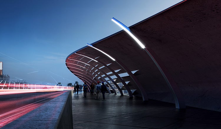
I do research about the site and location because there are a multitude of details to get right for the work to be effective. I get the model from our structural design team and marry that with images for the backdrop to set the atmosphere and the location.
Once I’ve pulled in the model we need to consider the fine points of the scene, adding localized details such as highway signage or vegetation that will appear around the project site. For example, the sky is important — are there normally clouds? What do they look like? What is the normal prevailing weather — it’s obviously different in Honolulu versus Seattle. What are the typical trees and vegetation? These details are significant in developing an honest backdrop that communicates our design.
Images are therefore part of our project design workflow and reviews. The work is built into the project cost and schedule from the start much in the same way aesthetics are integral from the start. In many ways our images are both a design tool and a deliverable. We use them in ongoing dialogue with designers, owners and communities as we develop the design.
Q. Which bridge visualization project has been the most challenging and rewarding from a professional standpoint?
A. For sure the Los Angeles Pedestrian Bridge has been the most fun.
Typically you’d expect a rendering with a wide shot of the bridge from above, as if you’re in a helicopter hovering omniscient above the city. But that’s not how anyone experiences that bridge in day-to-day life.
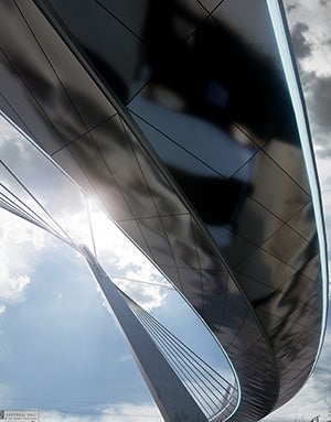
The bridge crosses the 101 freeway in Los Angeles, notorious for its traffic jams. Look at the reflections on the underside of the bridge deck in the rendering — that’s what most residents see of this project. They see it as they’re sitting in traffic on the 101, passing under the pedestrian bridge. I used an image of Los Angeles traffic, blurred on panels shaped in the style of renowned architect Frank Gehry, to evoke the reality. The backdrop sky is typical of the area with some haze, smog, clouds and sun. The rendering of this proposed signature bridge communicates how the project sits in the urban fabric. It allows viewers to step into the scene and emotionally connect to what the structure could represent once built. Sometimes I like to say it’s eerily realistic. That’s both fun and rewarding from a designer’s standpoint. It accurately provides our client with an elevated understanding of how the bridge will be perceived and function in its environment.
Q. Why does today’s social media environment affect how we use visualizations and renderings as we work with the public?
A. Positive portrayals can help build community and stakeholder support; portrayals that negatively reflect a project’s character or location can tank a project before it can advance. Before the days of ubiquitous social media we could show the public a conceptual sketch that was very preliminary, realizing we could dramatically alter it based on feedback. You didn’t have a citizen snap a photo and send it viral before the process was worked through.
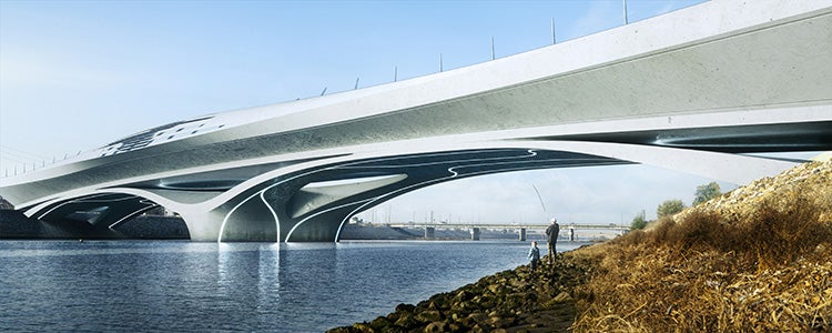
In today’s social media world you get one chance — a bad image gets spread on Instagram and you can’t get it back. It’s incredibly difficult to change public perception once the initial emotive response is registered. What that means for our renderings is an opportunity to use our emotional scene-setting to show communities on a very visceral level that we are meeting them where they live. We’re designing in their context. We are being transparent in our approach and commitment to deliver a signature bridge that is an asset to their community, in the right zone for cost and performance and that contributes to overall quality of life.
Inspiration and Advice
Q. Where do you get your design inspiration and how does your matte painting experience enrich your design perspective?
A. I was an industrial design major. I’ve always been very interested in visual communication. I’m fascinated with opportunities to show uncanny beauty, combining images that are familiar with those that seem foreign or do not belong.
Much later I became really interested in matte painting. There was a point where I felt my rendering work had plateaued creatively, so I took a workshop with Maxx Burman who is a concept artist and matte painter in the film industry. I wanted to understand that field and use that perspective to get off my plateau; it really helped me get to the next level creatively.
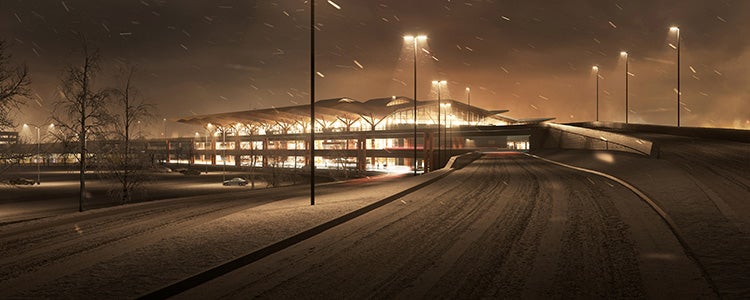
I used that perspective to produce an image for our project at the Pittsburgh airport that evoked an early morning winter day as the traveler approaches the main terminal. Our project manager declared that it exactly captures how he has felt on a typical snowy morning as he approached to catch his early flight. Feedback like that fuels my passion to continue to push the boundaries of what is expected and deliver added value during the project development process.
Q. What advice can you share with a community leader who wants an iconic structure?
A. Dare to strive for a signature structure that is honest and beautiful.
Each Experts Talk interview illuminates a different aspect of transportation infrastructure planning, design and delivery. Check back regularly to find new insights from the specialized experts and thought leaders behind our award-winning, full service consulting practice.


