Before You Walk through the Door: Site Design for Healthcare
Whether you’re a patient, visitor or staff member, arriving to your intended destination at a hospital can be quite challenging if destinations are not readily identified for you. Larger public hospitals that provide both inpatient and outpatient services produce substantially more traffic, not just internally, but externally as well. As designers, we have to think about this patient journey and empathize with the common struggles faced in order to create a more fluid experience.
A Critical Situation
Let’s break it down starting from the moment you get in your car. Your spouse withstood a fairly serious injury that requires immediate medical attention and you are now on your way to the local hospital. This is the first time you are seeking care at this specific hospital and your GPS is telling you to proceed to the intersecting street for the main hospital entrance. But as you approach the traffic light, you see a sign saying, “Emergency,” with an entrance driveway immediately next to it, but you miss the turn and continue on to the main entrance.
Already frustrated from having missed that turn, you notice your spouse is in greater pain and now your stress level is skyrocketing. Thankfully, as you drive through the main entrance, directional signage is provided and points to the emergency department. Further along you notice more signs to divert ambulance parking and general parking for emergency walk-ins. You then notice a drop-off for patients and decide to park your car there.
After escorting your spouse to the emergency department waiting area, you quickly return to your car and proceed to parking. The emergency room is busy and the closest spot you could find seems like it’s a football field away. It’s a hot day and you’re already perspiring from the haste of the events taking place. Luckily, there are sidewalks lined with trees providing shade and a direct line of view to get you back inside, and then you’re finally through the door.
Turning Chaos into Harmony
I’m sure the scenario described above is something we all can relate to in some degree, and this is just one of many depending on who you are and where you’re going. Proper site planning and site design in a healthcare environment is measured by how easy you make the experience for every scenario that could possibly present. Vehicle and pedestrian flow, parking and wayfinding, traffic control, calming devices and lighting are all basic planning and design considerations that should be addressed during site design, not after.

To discuss how this journey can be made easier, let’s start with the subject of one traveling by vehicle. There are typically at least five types of drivers that travel to and from a hospital on a daily basis:
- Ambulance
- Emergency walk-in patient
- Service and hospital support deliveries/logistics
- Inpatient visitor or extended stay
- Outpatient or temporary clinical treatment
- Staff
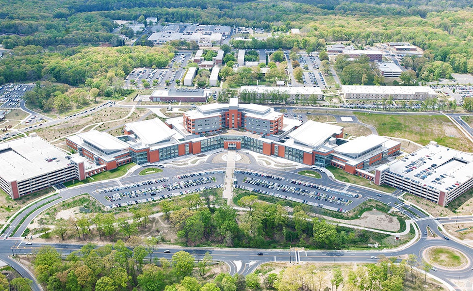
The challenge is in providing circulation for all five types of drivers that don’t conflict with one another, especially for those in an emergency situation, and doing so within the context of and whatever constraints are applicable to the site. This can be achieved by first providing multiple site entrances to distribute traffic flow.
Emergency vehicles typically take precedence and should have their own entrance to the site, although when necessary an ambulance should be able to use any entrance. Whenever possible, emergency walk-in should ideally have a separate site entrance as well, but often this is shared with the ambulance entrance. The hospital main entrance is typically intended to receive the most traffic flow, which will see use by inpatient and outpatient visitors, first-time hospital visitors as portrayed in the scenario described above, and sometimes staff. Service vehicle entrances, although not as celebrated as other entrances, typically require their own access to the site and are usually segregated as much as possible, both physically and visually, so as not to mingle with the rest of the population. You can consider them the “unsung heroes” who keep the hospital functioning behind the scenes.
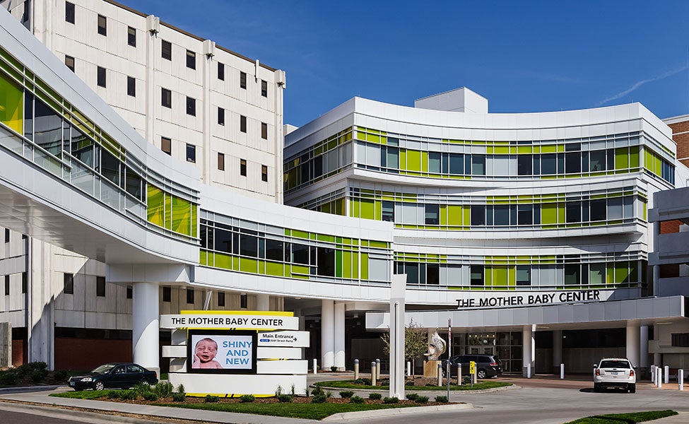
By far the most important driver and “special guest” is the patient. It is our job as designers and planners to make sure the patient has the most pleasant experience getting where they need to go, and that they get there safely. Patients are typically encouraged to use only the main entrance, which is often in close proximity to the main building entrance and access to parking.
Last but not least, there is the medical staff. Ideally, staff get their own special entrance so as not to mix with patients or patient visitors, but this isn’t always an affordable luxury depending on the site context, and so the main entrance or even the service entrance at times serve as their way in and out.
Parking
Equally as important as making sure the correct people get through the correct site entrance is making sure those people park where they should. The last thing anyone needs is to find a great parking spot and then realize that they have a 10-minute walk after the fact, or even have to return to their vehicle to re-route. Proper wayfinding signage is critical for making sure people get to the right place in the shortest distance possible. This can be even further complicated if multiple parking methods are provided, including surface parking and structured parking (on or below grade). When possible, designated parking for the five driver types listed above should be implemented.
Let’s Get Specific with Traffic
Traffic control and calming devices must be utilized wherever there is crossover of pedestrian and vehicle circulation, which should be minimized as much as possible. A patient or their family is already under enough distress and not in the best frame of mind when visiting the hospital; so the last thing they need to worry about is getting in a car accident while trying to get there. Speed tables to slow down vehicles, clearly defined and properly placed crosswalks with signage and strategic changes in pavement type are a couple examples of devices that can assist in mitigating traffic flow conflicts.

Typically, it’s good practice to keep the primary vehicle circulation loop around the hospital at the perimeter of the site, outboard of the parking areas and furthest away from people walking in and out of the hospital. Although, in an urban context where there are tighter site constraints and the loop road is the public city road, this of course is more difficult to achieve.
A hospital is a 24-hour service facility, and site lighting is critical to ensuring both pedestrians and vehicles can circulate safely. Roadways, parking, walkways, signage and building entrances must be properly lit for all of the reasons just described. It’s good practice for site planners or landscape architects to work closely with electrical engineers, lighting designers and wayfinding specialists to provide suitable lighting fixtures in the proper locations that achieve both the aesthetic and functional design intent for the project.
Much of this is generally proper site design for any project type; however, for healthcare, all of the design and engineering disciplines need to be extra sensitive toward how decisions are made in order to deliver the most well-thought-out product for people in need of medical care, and for the professionals responsible for providing that service to them, before they even get through the door.


