Shirley Ryan AbilityLab Pediatric and DayRehab Center

Shirley Ryan AbilityLab Pediatric and DayRehab Center
Design for Rehabilitation
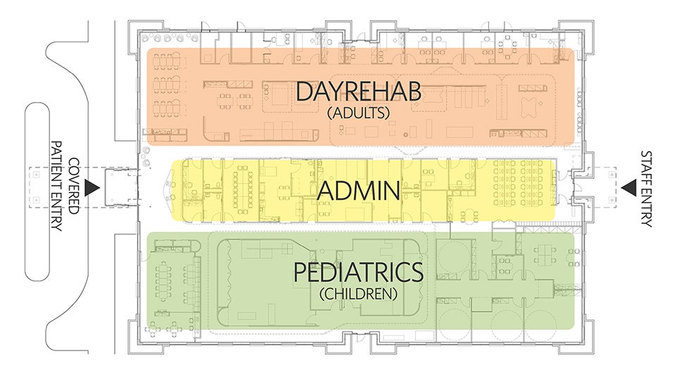
Tucked away inside a speculative office building in suburban Chicago lies a new rehabilitation outpatient center for the Shirley Ryan AbilityLab, a specialty, non-profit hospital serving patients with the most severe, complex conditions. Catering to both adults and children, the interior design for this facility needed to solve several challenges. Importantly, the spaces for children and adults had very different requirements in terms of equipment and atmosphere, yet still needed to project a unified brand identity. Dividing the space in two resulted in awkwardly long, linear spaces — a spatial challenge solved using a series of floating volumes and colored acoustic baffles.
The reception area serves as a gateway between the two distinct spaces. Curved walls allow for “frictionless” movement, especially for people with functional impairment—frequently accompanied by pain—and those who use wheelchairs and other mobility devices. They also introduce a softness as patients enter their respective spaces.

Bright Colors Inspire Hope and Hard Work
Like the Shirley Ryan AbilityLab hospital in downtown Chicago, everything about the interior design of this outpatient facility speaks to optimism and hope, including the creative use of bold, energetic colors with expansive white surfaces. Here, patients no longer require hospitalization, but still require intensive rehabilitative care.
In the Day Rehab space, colored baffles gradate from red to orange to yellow, intuitively defining various zones within the space. Together with the floating volumes, the baffles break down the length of the therapy space, while also providing acoustical comfort and intuitive wayfinding. Floating volumes define various treatment areas, and are used for mounting equipment and to provide discreet areas for storage — while allowing open views across the space for patient safety. Bright colors and ample access to daylight encourage and energize patients in their rigorous therapy.
Design as a Tool for Treatment
A calmer atmosphere was required for the pediatric side to keep children focused on their physical, occupational, and/or speech-language therapy. Floating volumes define two separate therapeutic spaces. Ceiling baffles, walls and floors in muted colors are juxtaposed against the bright colors of children’s equipment and toys used in treatment. A family waiting area features similar calming colors and is a place for parents and siblings to wait during therapy sessions.
Corridors double as treatment space to maximize efficiency; white walls encourage children to focus on the floor’s colored circles, which are spaced at specific intervals as therapy aids — emblematic of how design serves not only as an aesthetic backdrop, but as a tool for treatment, too.
Intentional Material Choices
In order to maximize mobility and safety for patients, rubber sheet flooring is used in most spaces because it’s easy to walk on, easy to clean, and provides a cushion for patients who may need it. The flooring is made of natural rubber, a rapidly renewable resource that is PVC-free and does not require any waxing, stripping or finishing. It also has great footfall sound absorption, and is easily repairable without requiring the removal of large expanses of the material. Wall protection, acoustic baffles and carpet were selected for their recycled content, and both carpet and baffles are recyclable. Low volatile organic compounds paints, adhesives, sealants and furnishings improve indoor air quality, helping to ensure a healthy building for patients and staff.


